Creating your first website in WYSIWYG Web Builder

Building a website doesn’t have to be complicated. With WYSIWYG Web Builder, you can design and publish a professional-looking site without writing a single line of code. Whether you’re a complete beginner or just getting familiar with the software, this tutorial will guide you step-by-step through the essential ways to create your first website.
In this tutorial, we’ll cover four main methods to build a website:
Using the Website Wizard – Start quickly with a guided setup that helps you create a functional website in just a few clicks.
Using Templates – Choose from ready-made designs to jump-start your project and customize it to match your style.
Using Blocks – Build your website visually by combining pre-designed layout blocks for fast and flexible page creation.
Creating a New Website from Scratch – Learn how to use the toolbox to design your own unique layout and bring your ideas to life.
Each method offers different levels of control and flexibility, so you can pick the approach that best fits your goals and skill level.
Create a New Website Using the Website Wizard
The Website Wizard in WYSIWYG Web Builder is the quickest way to create a complete, functional website in just a few steps. The wizard guides you through selecting options choosing a color scheme, and adding essential pages like Home, About, and Contact. Once the basic structure is generated, you can easily customize the content and design to match your needs. It’s a perfect starting point for beginners who want to get their website online quickly without starting from scratch.

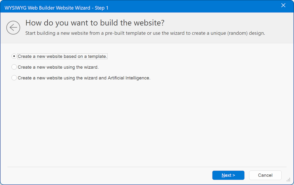
The Website Wizard has 3 options to help you get started building a new website:
• Create a new website based on a template
• Create a new website using a wizard
• Create a new website using a wizard and Artificial Intelligence
• Create a new website based on a template
• Create a new website using a wizard
• Create a new website using a wizard and Artificial Intelligence
Learn more about the Website Wizard
Create a New Website Using Templates
Templates in WYSIWYG Web Builder provide another quick and easy way to start building your website with a pre-defined design. Simply choose a template that fits your style or purpose, then replace the sample content with your own text, images, and branding. Templates save time and give you a solid foundation to work from, while still allowing full customization of layout and design.
Choose from over 250 templates available on our platform, with even more options accessible through third-party websites.
Choose from over 250 templates available on our platform, with even more options accessible through third-party websites.

Learn more about using templates
Create a New Website Using Blocks
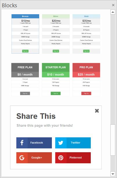
In WYSIWYG Web Builder, the Blocks feature gives you a streamlined way to build and customise your web pages using pre-designed sections (for example headers, footers, text regions or forms).
Here’s a quick breakdown of how it works and why it’s useful:
You open the Blocks Manager, select a block from one of the categories (Content, Features, Headers, Footers, Forms etc).
Drag & drop the block onto your page workspace. It will slot into the next free row if it uses a layout grid.
Once inserted, you can fully customise the block: change content, layout, style, move it around with the Arrange tools.
Blocks are especially great when you want to build a page quickly using professional-looking sections, but still retain full control to tweak and personalise.
Learn more about using Blocks

Creating a New Website from Scratch
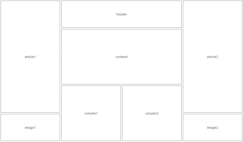
Creating a new website from scratch in WYSIWYG Web Builder gives you complete control over every detail of your design. You can start by dragging and dropping objects from the Toolbox directly onto the workspace to build your layout exactly the way you want.

Choosing what type of layout to use (flexible vs absolute)
Before you begin, it’s important to decide whether to use absolute or flexible layouts, as this affects how your content will behave on different screen sizes.
Fixed/absolute layouts
By default layouts are fixed using absolute positions. This means that you can place objects anywhere you like, so you have complete control over the layout. The downside of this layout mode is that it will be harder to make the page responsive because the layout will only look perfect on the screen size it was designed for. To make sure the layout also looks good on smaller screens you will have to implement breakpoints.
Related tutorials:
https://wysiwygwebbuilder.com/responsivewebdesign.html
https://wysiwygwebbuilder.com/rwd_basics.html
Flexible/floating layout
You can also implement flexible layouts by using Layout Grids or Flexbox. When using layout grids, the layout is controlled by the grids. Objects will automatically resize based on the available space in the viewport and the grid column size.
The downside of using layout grids is that you have less control over the layout. All objects will be positioned and resized automatically. So you are forced into a structured layouts.
Related tutorials:
An introduction to the Layout Grid
An Introduction to Flex Grid
Related Tutorials
An introduction to the basic functionality of WYSIWYG Web Builder
Page Properties Overview
Adding Text to a Web page
Adding Images to a Web page
Add a Video to Your Web Page
Linking Pages
Working with Projects (.wbs)
Preview a page in your Browser
Publishing your web pages
Page Properties Overview
Adding Text to a Web page
Adding Images to a Web page
Add a Video to Your Web Page
Linking Pages
Working with Projects (.wbs)
Preview a page in your Browser
Publishing your web pages